Ford Motors
Improving efficiency and internal tooling for the Ford risk team
I broke down Ford's legacy scoring dashboard and rebuilt it into a tool that finally gives the Risk team clarity instead of chaos. I surfaced scoring variables and tier logic upfront, cleaned up the layout around how analysts actually work, and added intuitive filtering to speed up reviews.
I also introduced a new tool so analysts can adjust variables and instantly see how scores and tiers shift. And to keep this scalable, I wrapped everything in a lightweight design system aligned with Ford standards
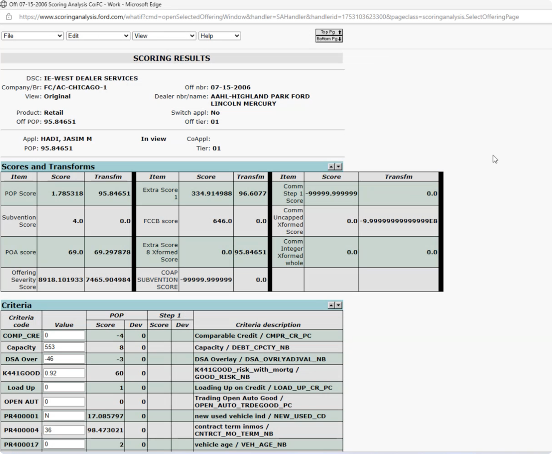
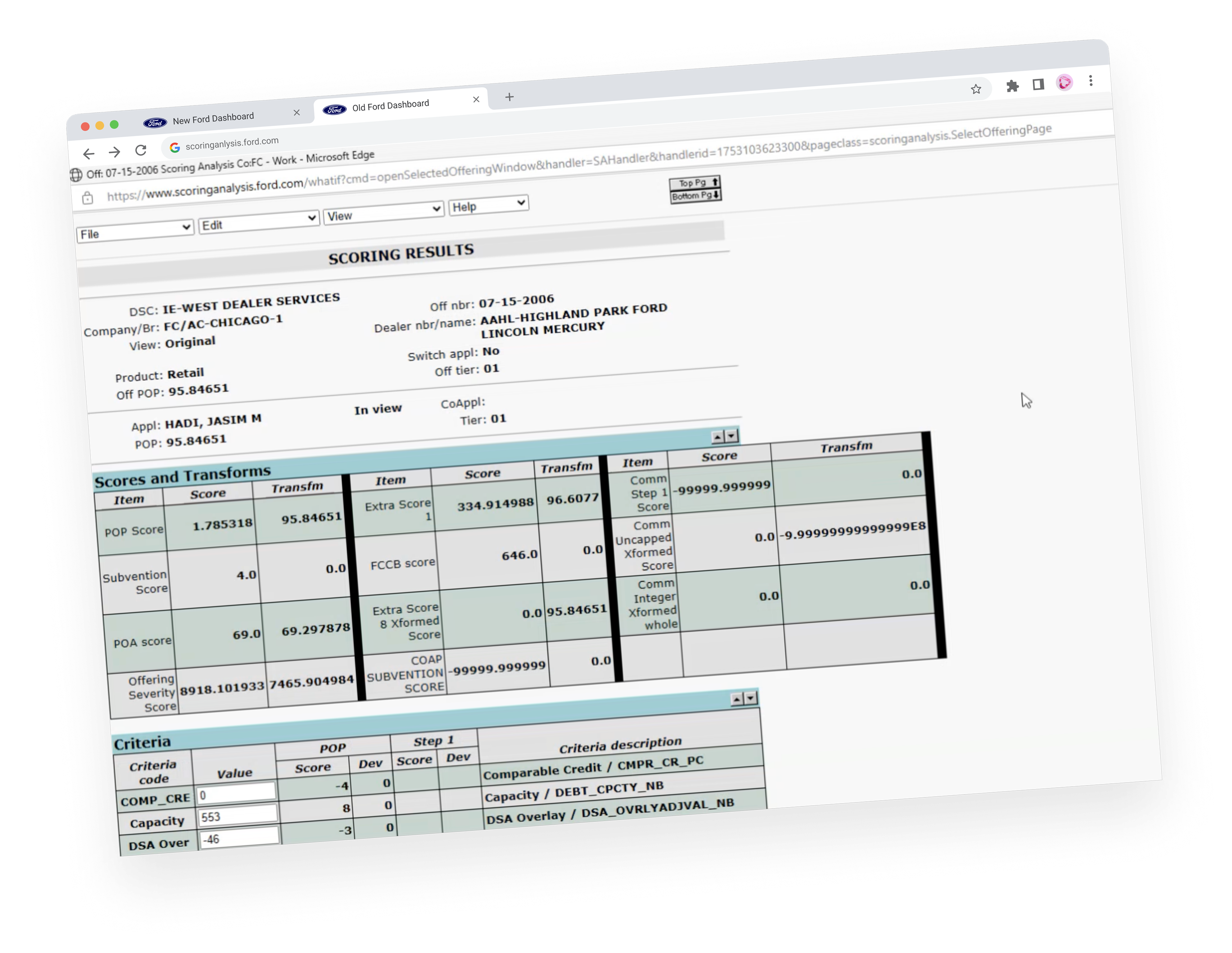
The Scoring Analysis dashboard was running on a legacy system that hadn't been updated for decades. It consisted of outdated tables, poor hierarchy, and almost no flexibility. Risk teams struggled to quickly understand why an offering scored a certain way, making it slow to validate results or respond to requests from operations.
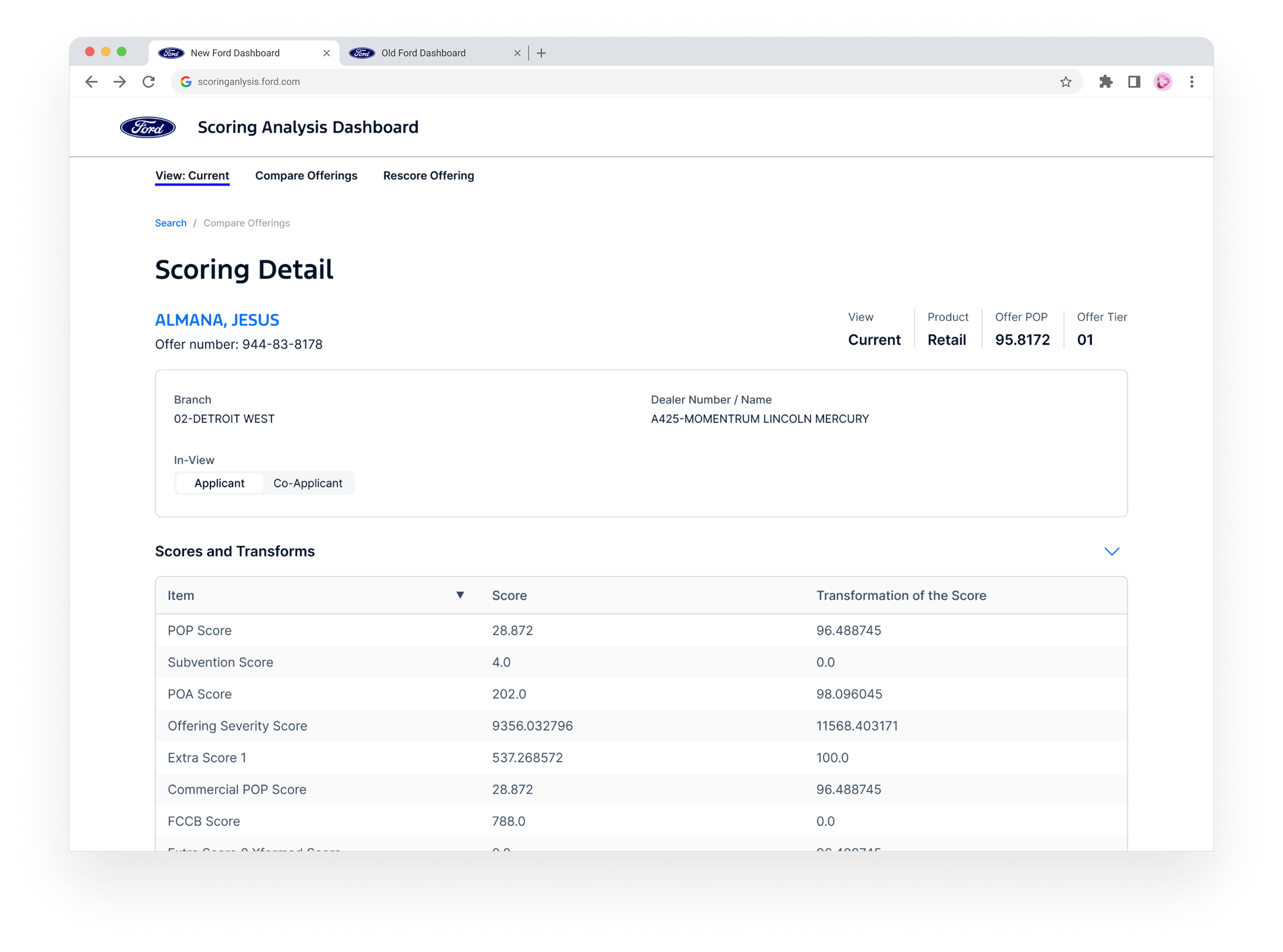
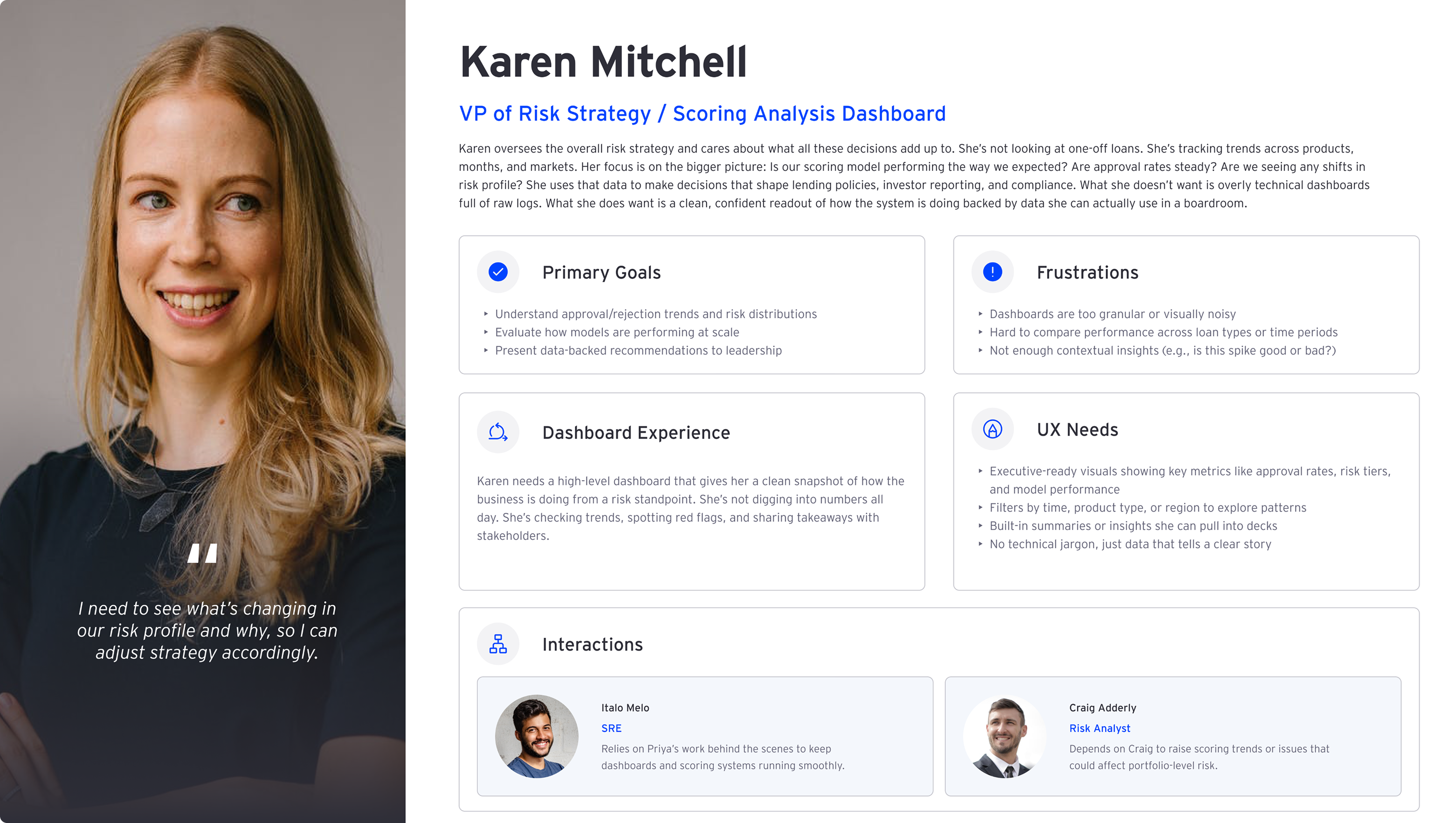
Ford Credit evaluates loan applicants using dozens of risk variables. The Scoring Analysis dashboard helps the Risk team understand how those variables influence a score—so they can validate decisions and explain outcomes with confidence.
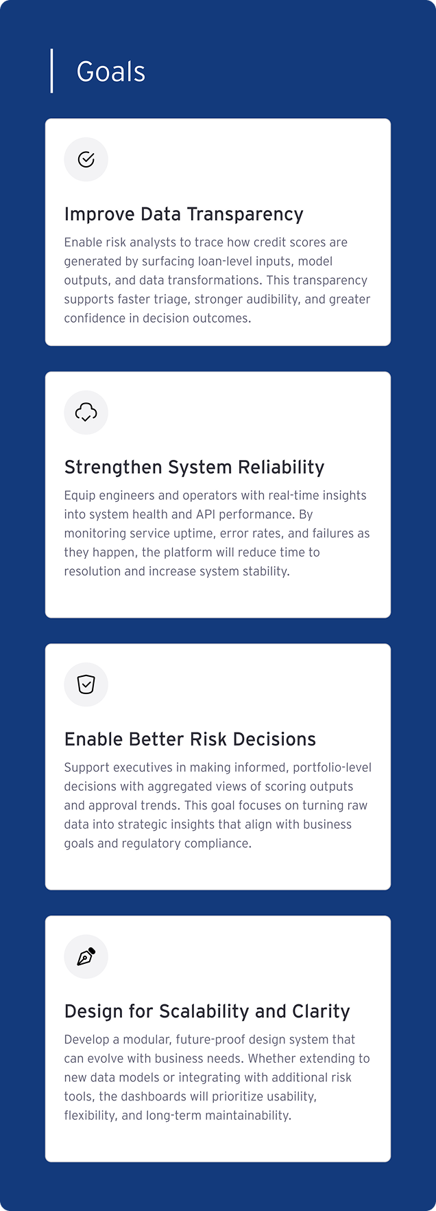
Increase productivity & accuracy
Since this was the first time this team brought in a designer to help them solve their problems, I came in to understand the problem and define a process with them. By partnering with the team, I defined the following metrics for success:
Respond Faster
Provide clear explanations to Operations requests about why something scored the way it did
Flag Inconsistencies
Identify unusual results accurately and as fast as possible
Surface Key Variables
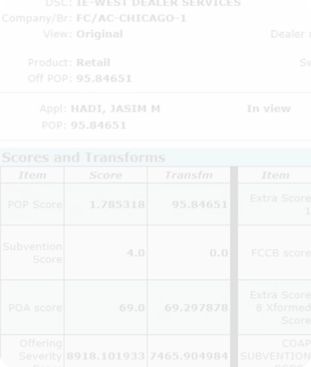
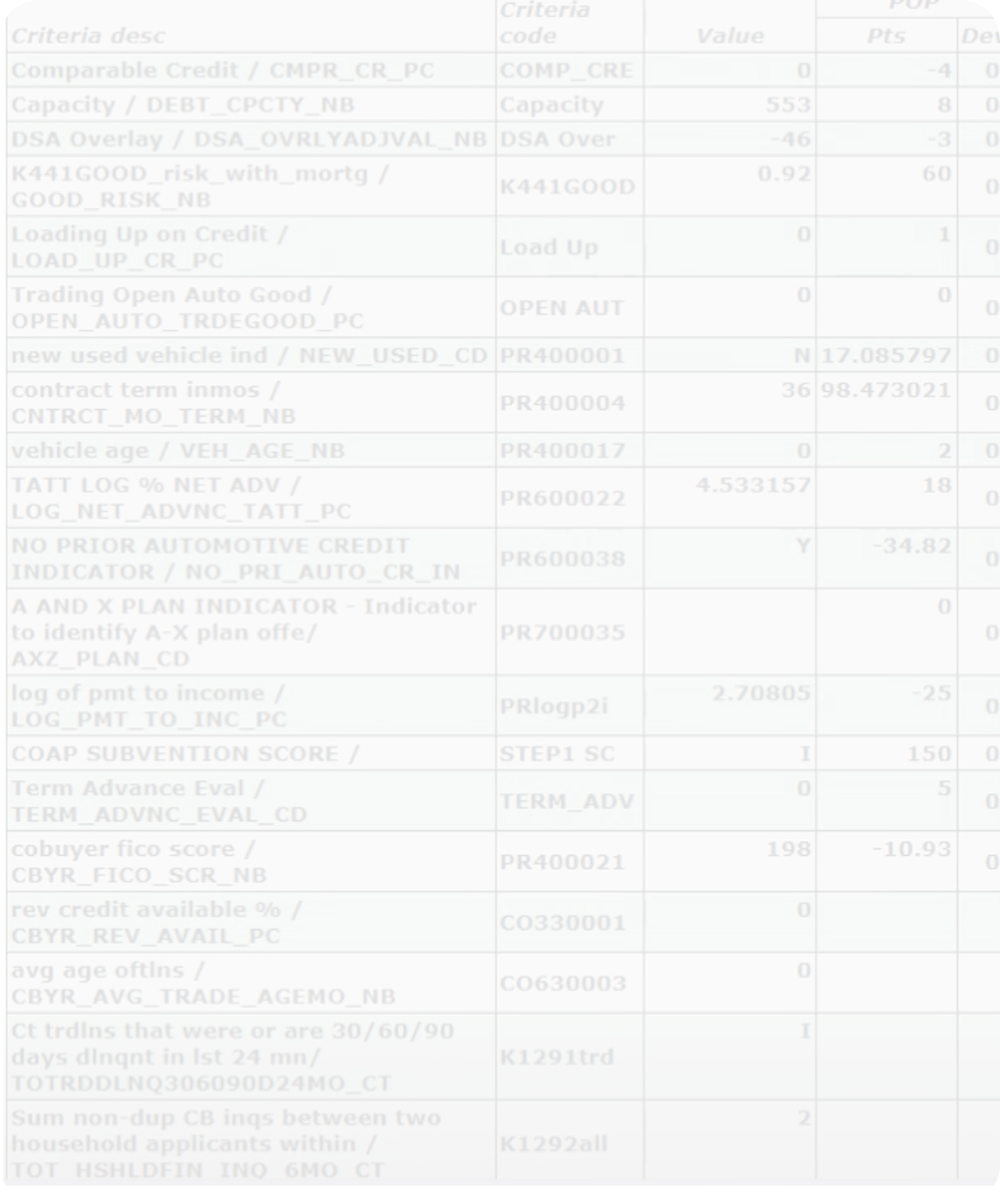
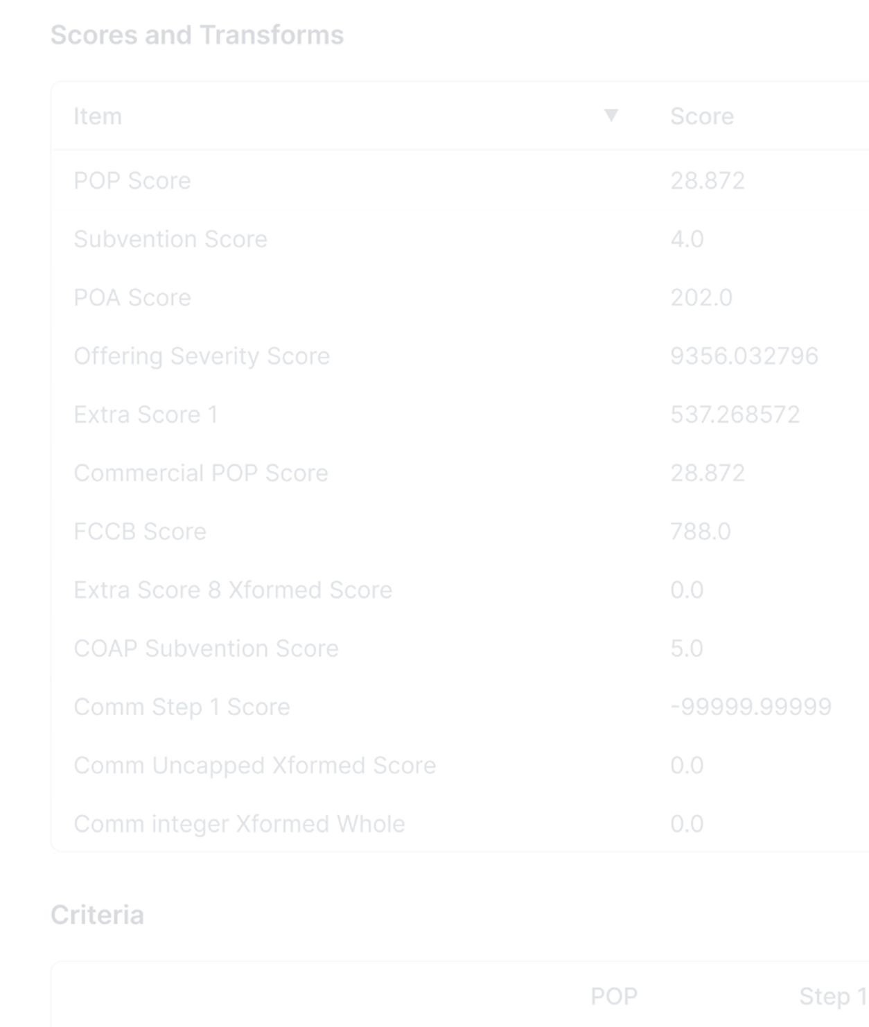
Display critical scoring variables like POP (probability of payment) and tier scores for any loan or offering
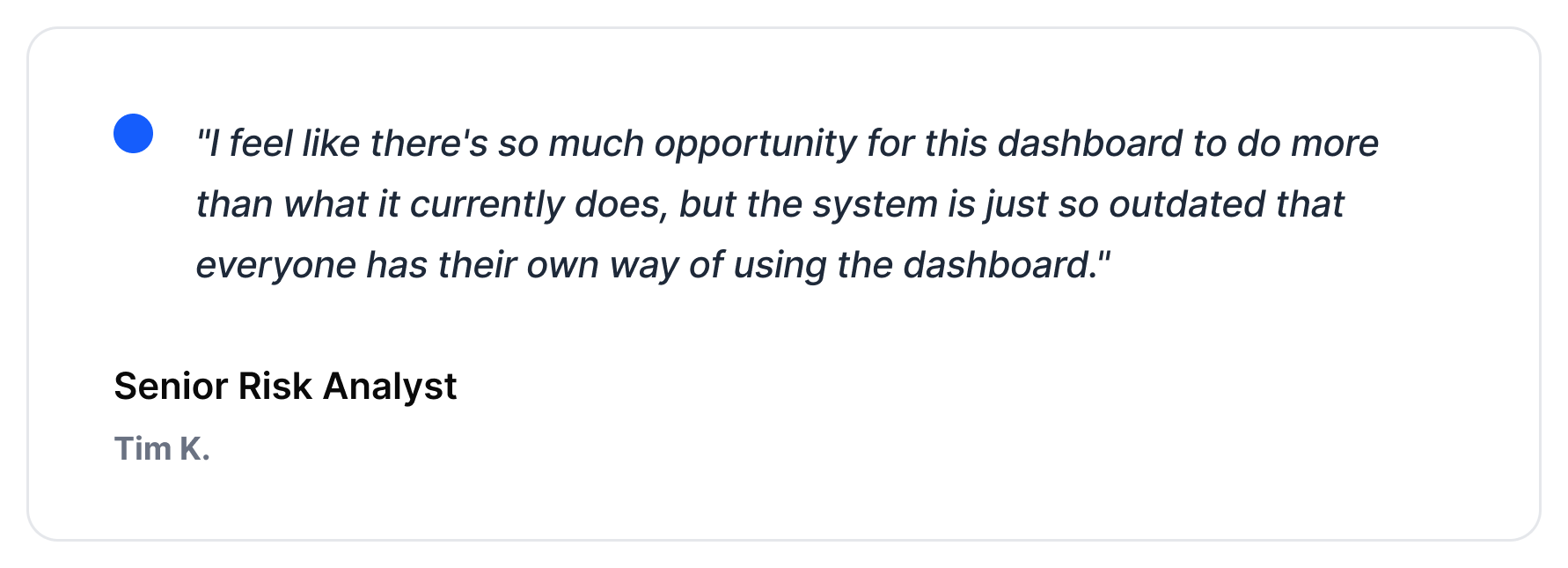
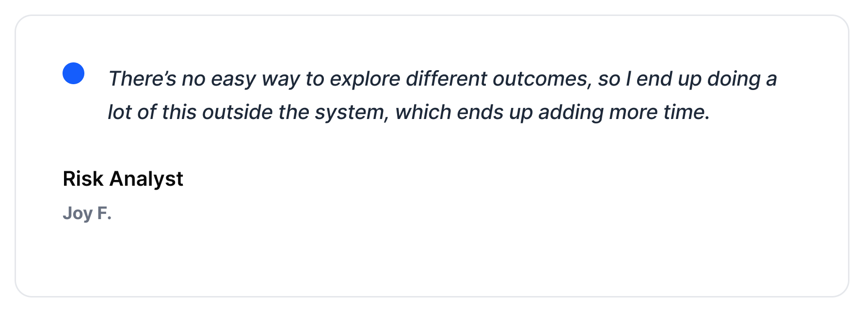
There's user appetite to adopt this tool and make it part of their workflow, but the barriers are hard to overcome, leading to scattered processes.
What does “success” look like for the user?
The team didn't just want a visual refresh — they needed a tool that worked smarter. The goal was to help the Risk team quickly pull up, understand, and explain the scoring behind any offering without digging through outdated tables.
Productivity Metrics
How long users spend reviewing data; not necessarily screen time, but workflow time
Accuracy & Confidence
How often users can validate results without needing to cross-reference external sources or escalate to Review Analysts
Daily Integration
How consistently team members rely on the dashboard for scoring analysis tasks versus alternative methods or workarounds
Audit the existing dashboard
The team didn't just want a visual refresh — they needed a tool that worked smarter. The goal was to help the Risk team quickly pull up, understand, and explain the scoring behind any offering without digging through outdated tables.
Define “needs” & “nice-to-haves”
I started by meeting with stakeholders across risk, product, and development to define what had to be included for MVP — and what could be intentionally left out for now.
Understand what users need to do their job
As I interviewed analysts and observed their workflows, one thing stood out quickly: the dashboard didn’t support exploration. Analysts wanted to test scenarios, compare outcomes, and make decisions faster, but the dated UI worked against them.

Build style library
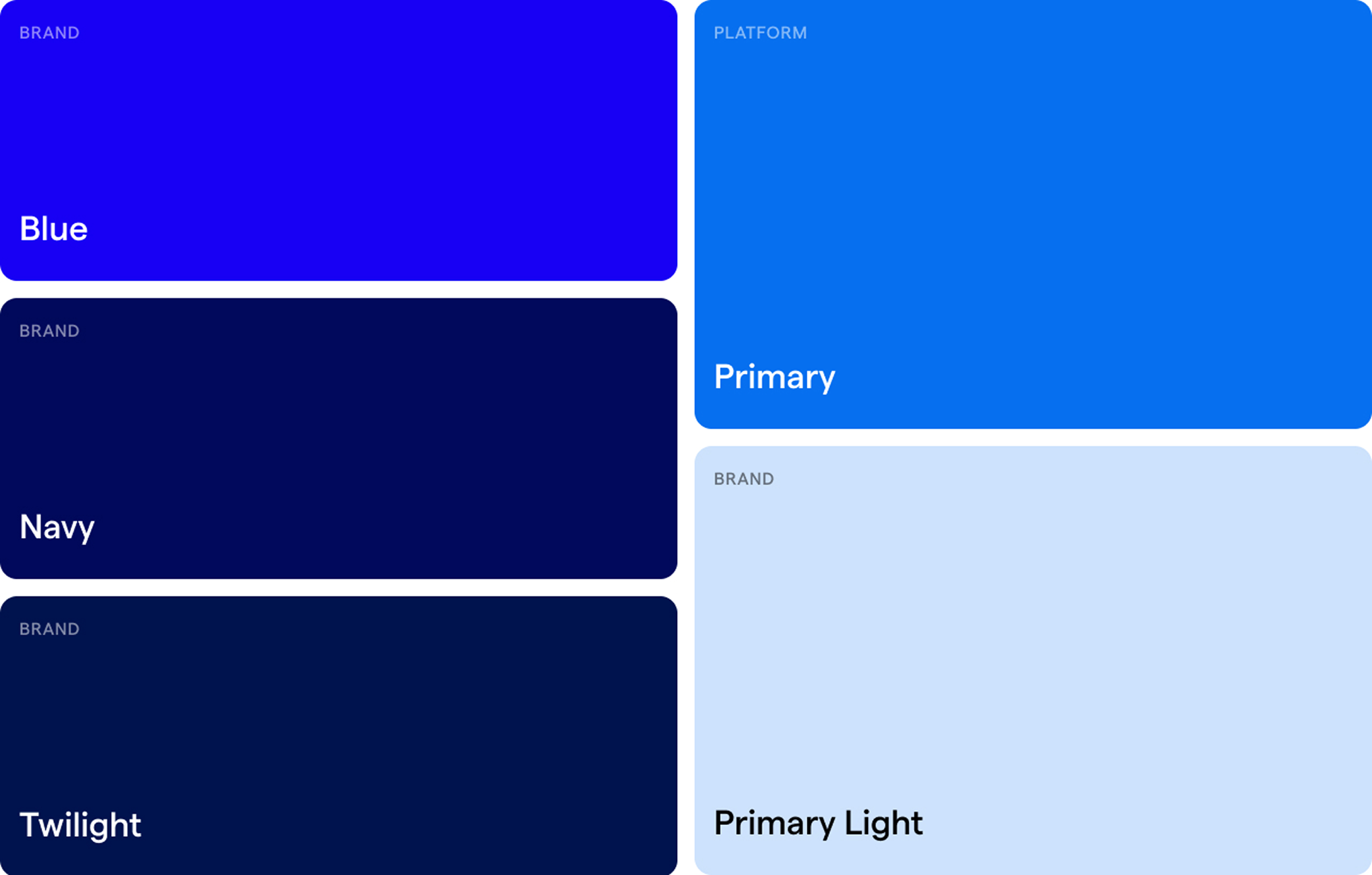
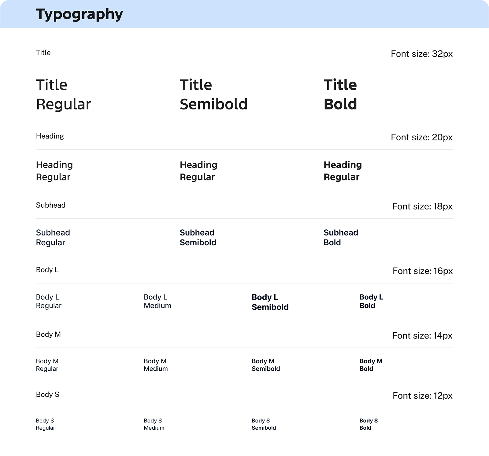
I created a style foundation with updated typography, spacing, and color usage to align with Ford's design standards, helping the team continue to build and improve this product over time in a scalable way.
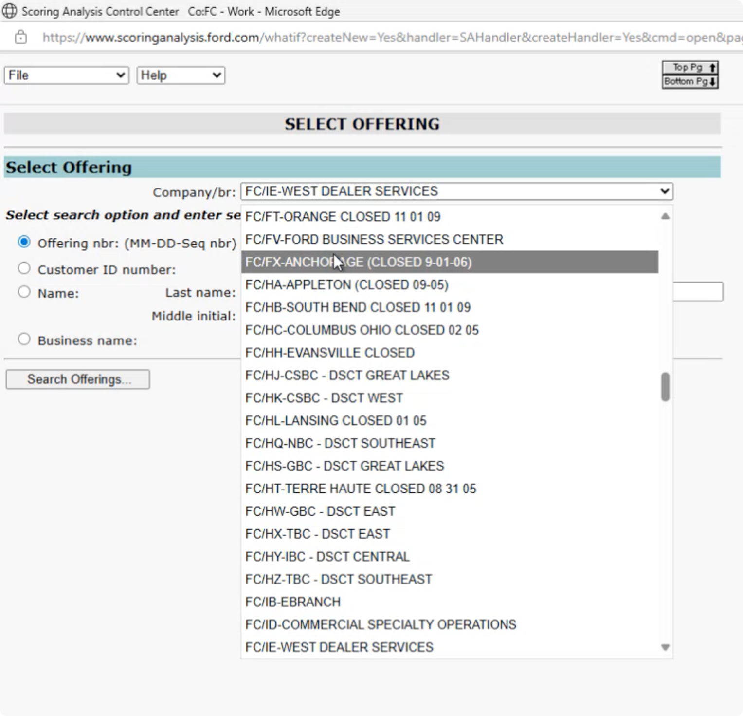
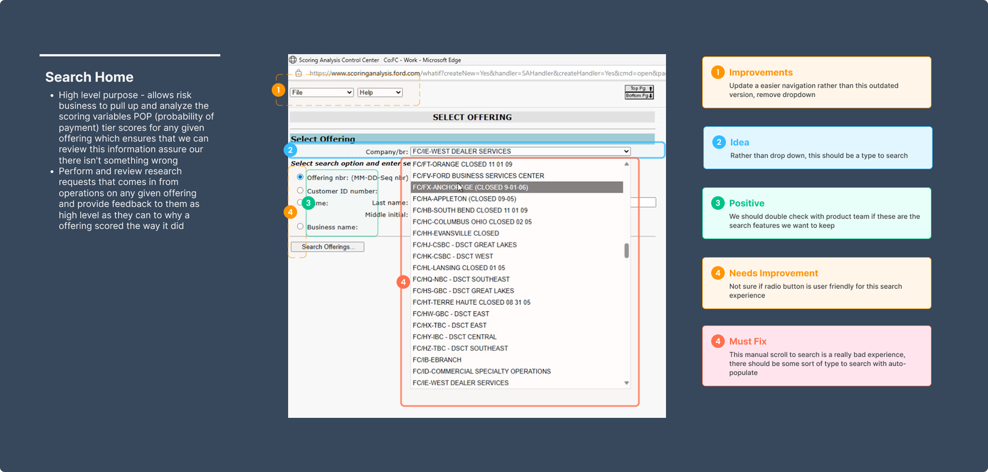
Smart Search with Auto-Suggest
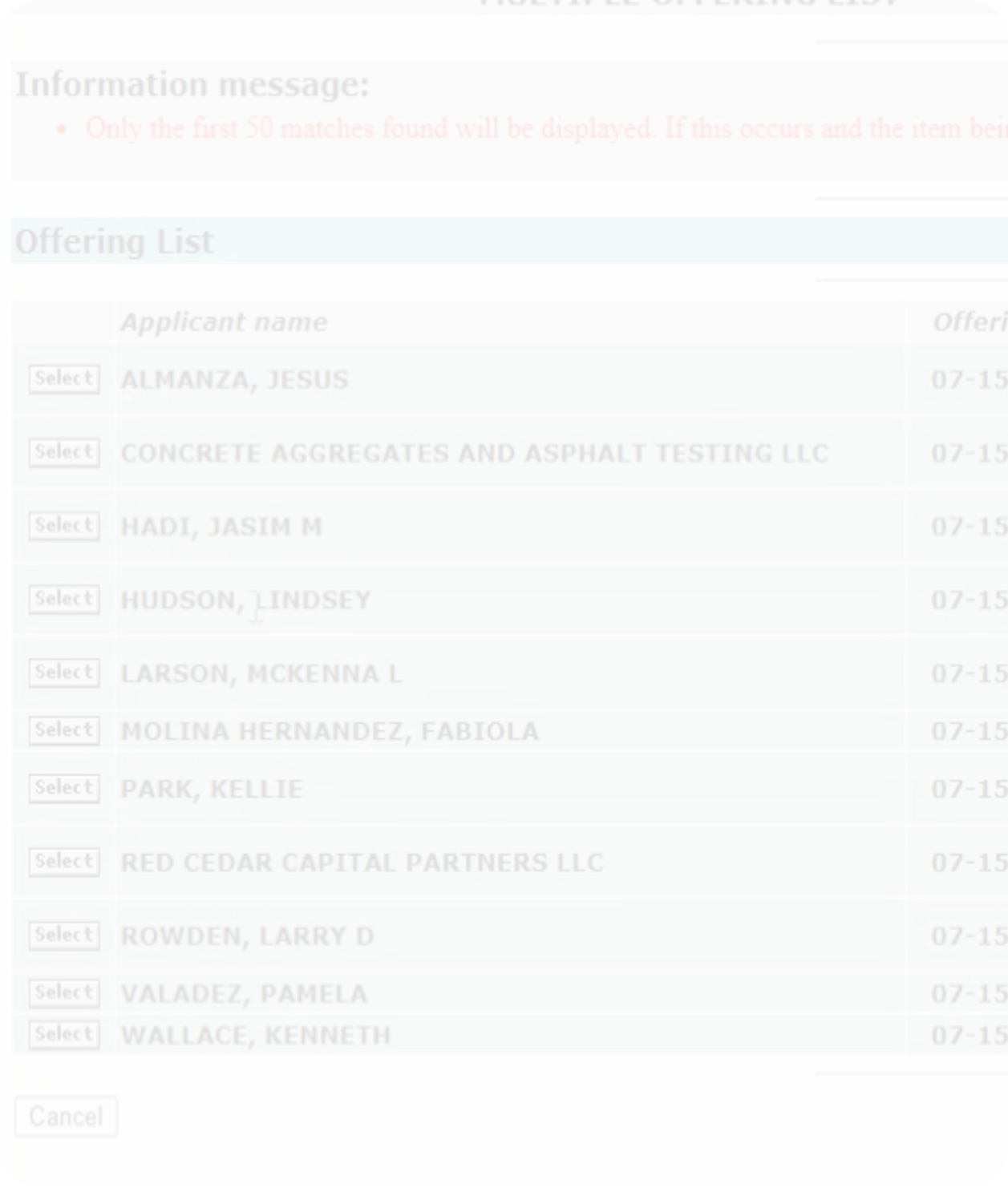
The original experience required users to manually scroll through long lists to find a company or branch — slow, tedious, and easy to misclick.
I replaced manual scrolling with a type-ahead search that auto-suggests results as the user types. This allows analysts to quickly locate the exact company or branch they’re looking for with minimal effort.
This removes unnecessary friction from a task users perform repeatedly, reducing time spent searching and helping analysts stay focused on decision-making instead of navigation.
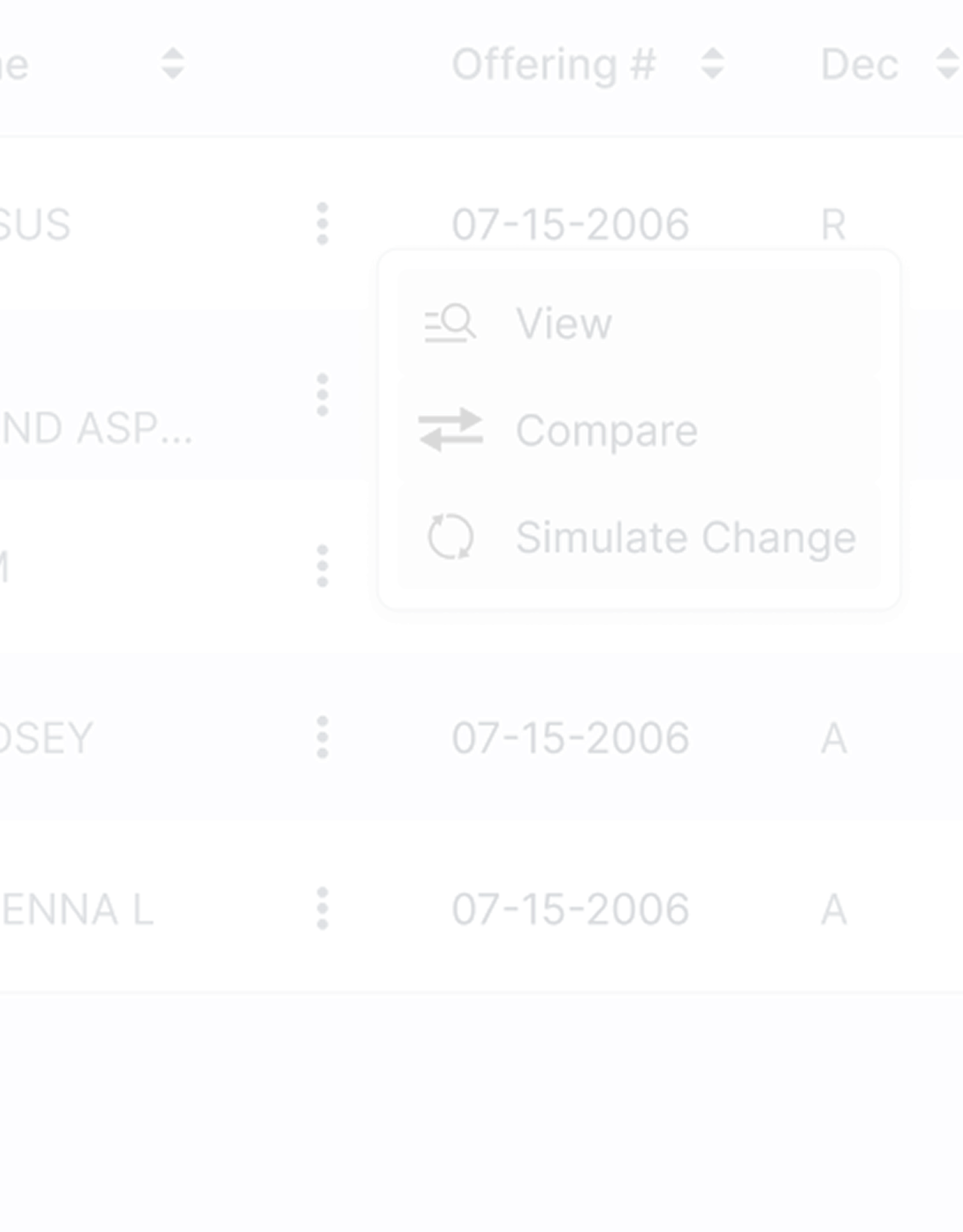
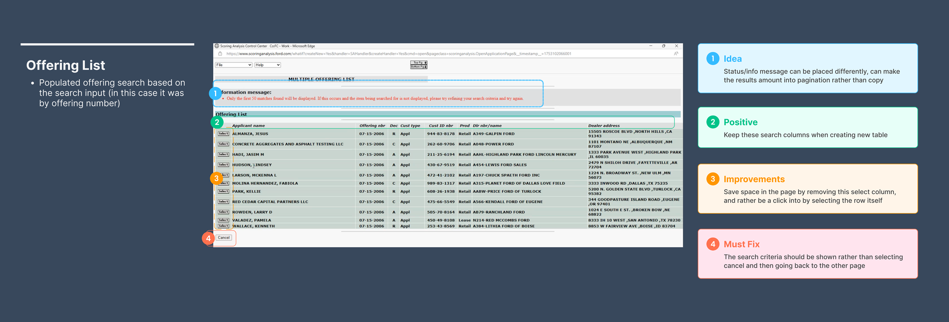
Actions Column for Faster Decisioning
Previously, viewing different pages or taking action required clicking into an applicant, navigating to another page, and then returning — a repetitive and inefficient workflow.
I introduced an Actions column with a kebab menu that lets users directly view related pages or take actions (like running a simulation) without leaving the table.
By surfacing key actions at the table level, analysts can move faster, maintain context, and reduce unnecessary page hops during reviews.
View & Compare Offerings — UI Refresh
The original View & Compare pages were cluttered, dense, and difficult to scan, making it hard for users to quickly understand differences between offerings.
I redesigned the UI with clearer hierarchy, improved spacing, and more readable layouts. I also added expandable and collapsible sections so users can hide information they don’t need to see.
This removes unnecessary friction from a task users perform repeatedly, reducing time spent searching and helping analysts stay focused on decision-making instead of navigation.
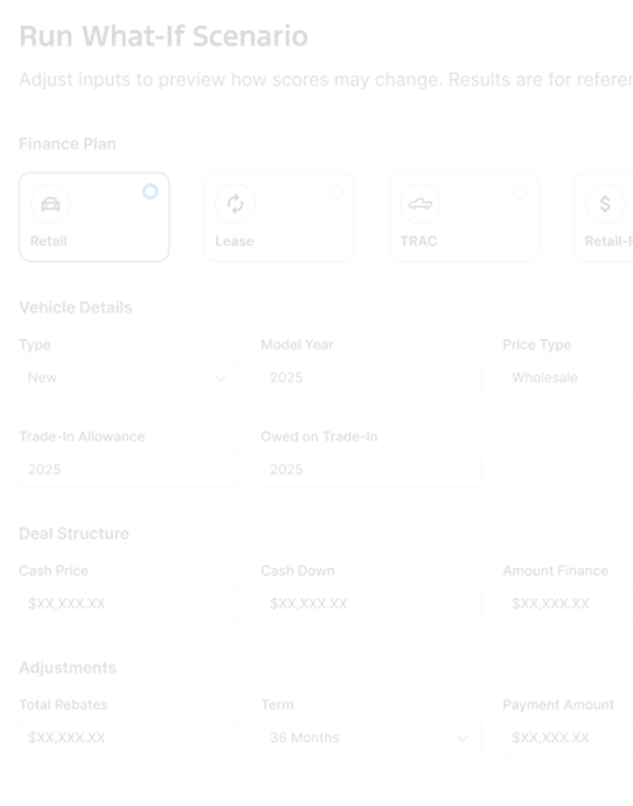
What-If Scenarios (Modern-Day ETA)
Business analysts don’t own the scorecard or underlying credit model — those are managed by the credit decisioning team — which meant analysts couldn’t easily explore alternatives without back-and-forth handoffs.
I designed a What-If scenario tool that allows analysts to adjust offering-level variables (such as payment amount or term length) and instantly see how those changes impact model outputs like POP, tier, variables, and points.
This gives analysts a safe, exploratory way to answer “what if?” questions without modifying scorecard logic. It acts like a modern-day ETA — enabling faster analysis, better recommendations, and fewer dependencies on other teams.
Observed Impact
Through user observations and testing sessions, I validated that the redesign significantly improved analyst workflows. Teams reduced their multi-tool process, eliminated workarounds, and completed scoring reviews faster—giving stakeholders the confidence to move forward with development.
Discovery Through Observation
Discovery Through Observation
Through user observations and testing sessions, I validated that the redesign significantly improved analyst workflows. Teams reduced their multi-tool process, eliminated workarounds, and completed scoring reviews faster—giving stakeholders the confidence to move forward with development.