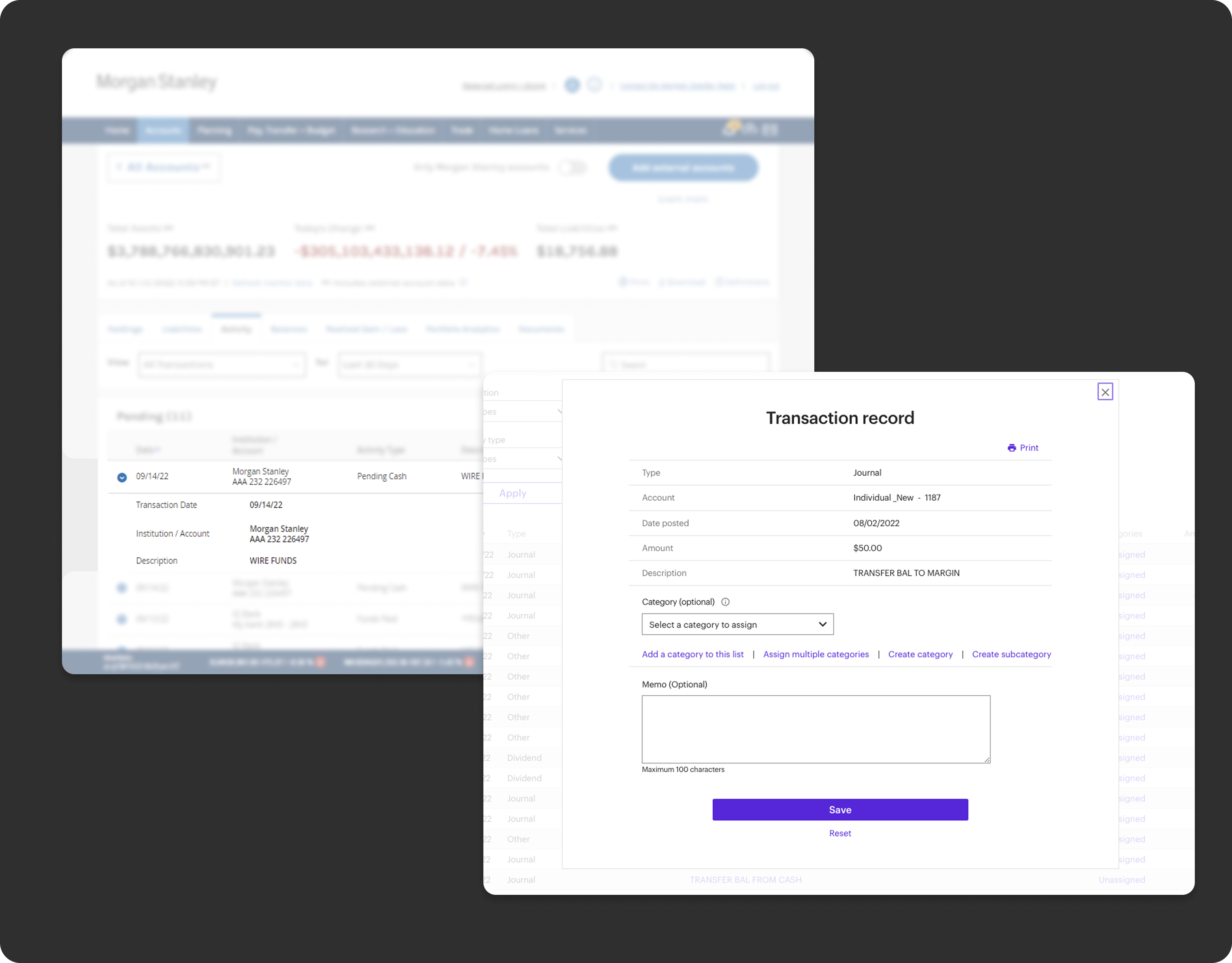
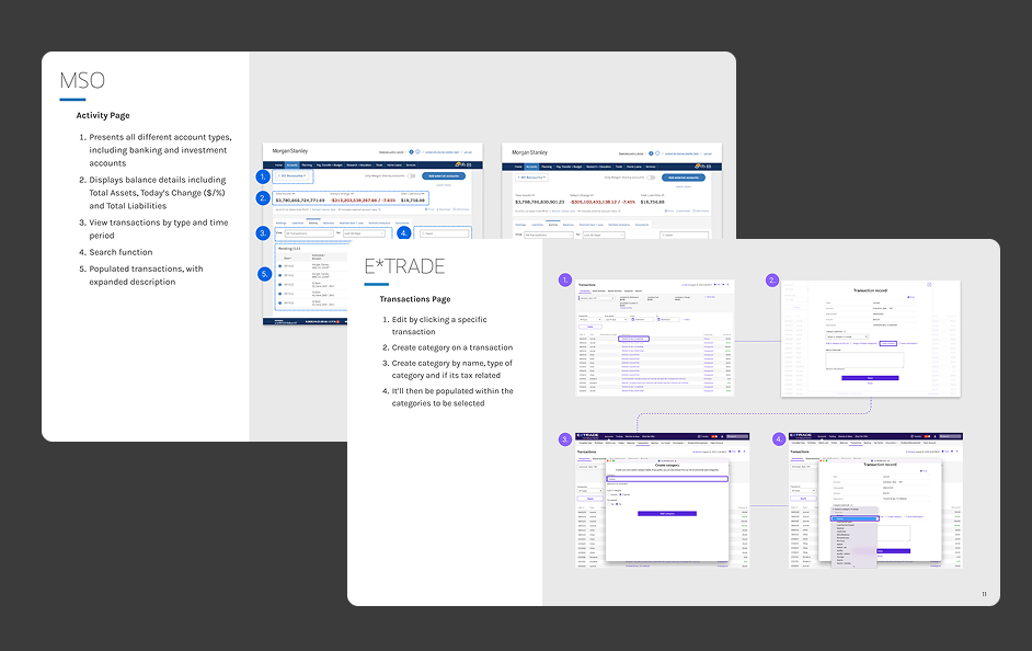
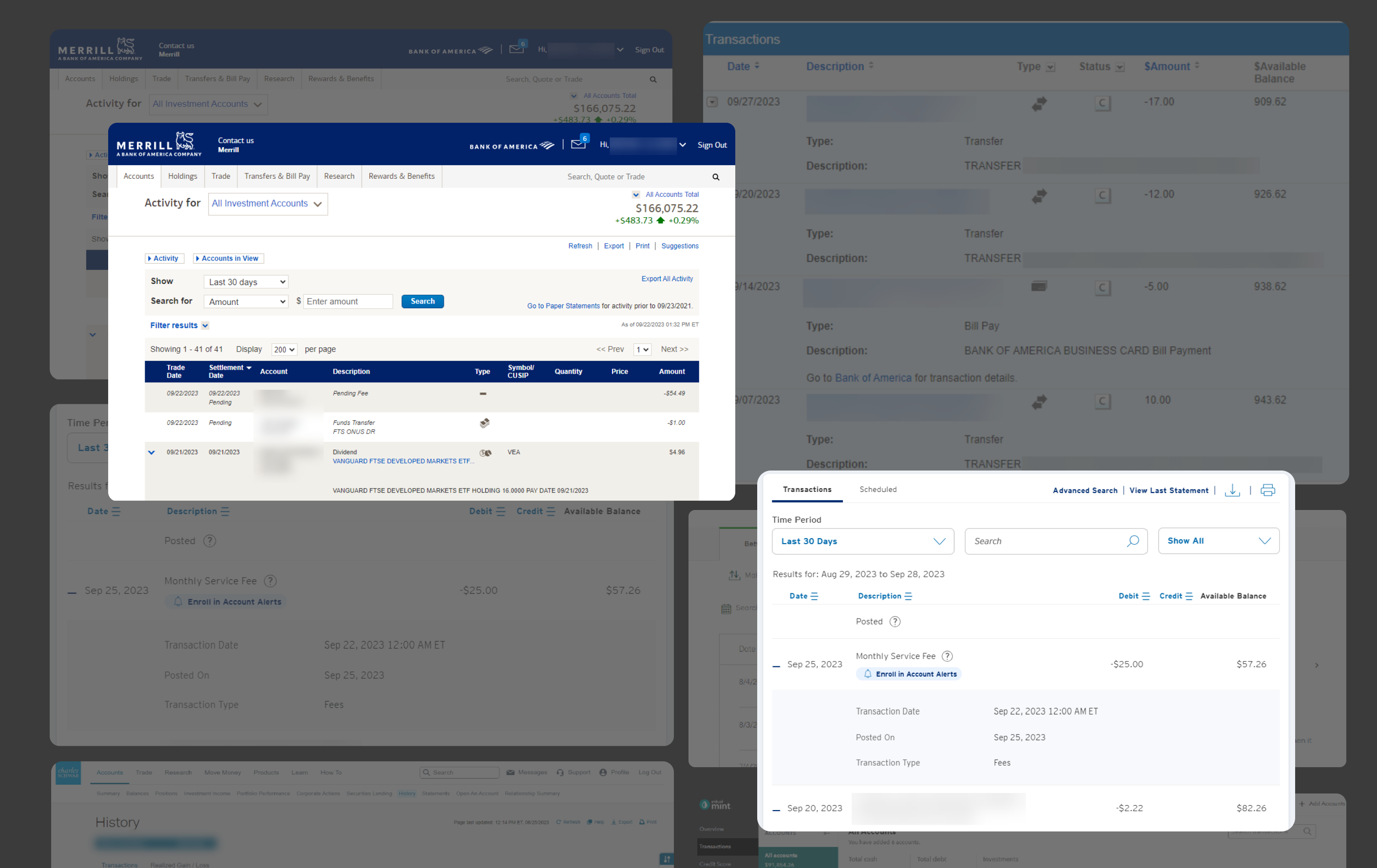
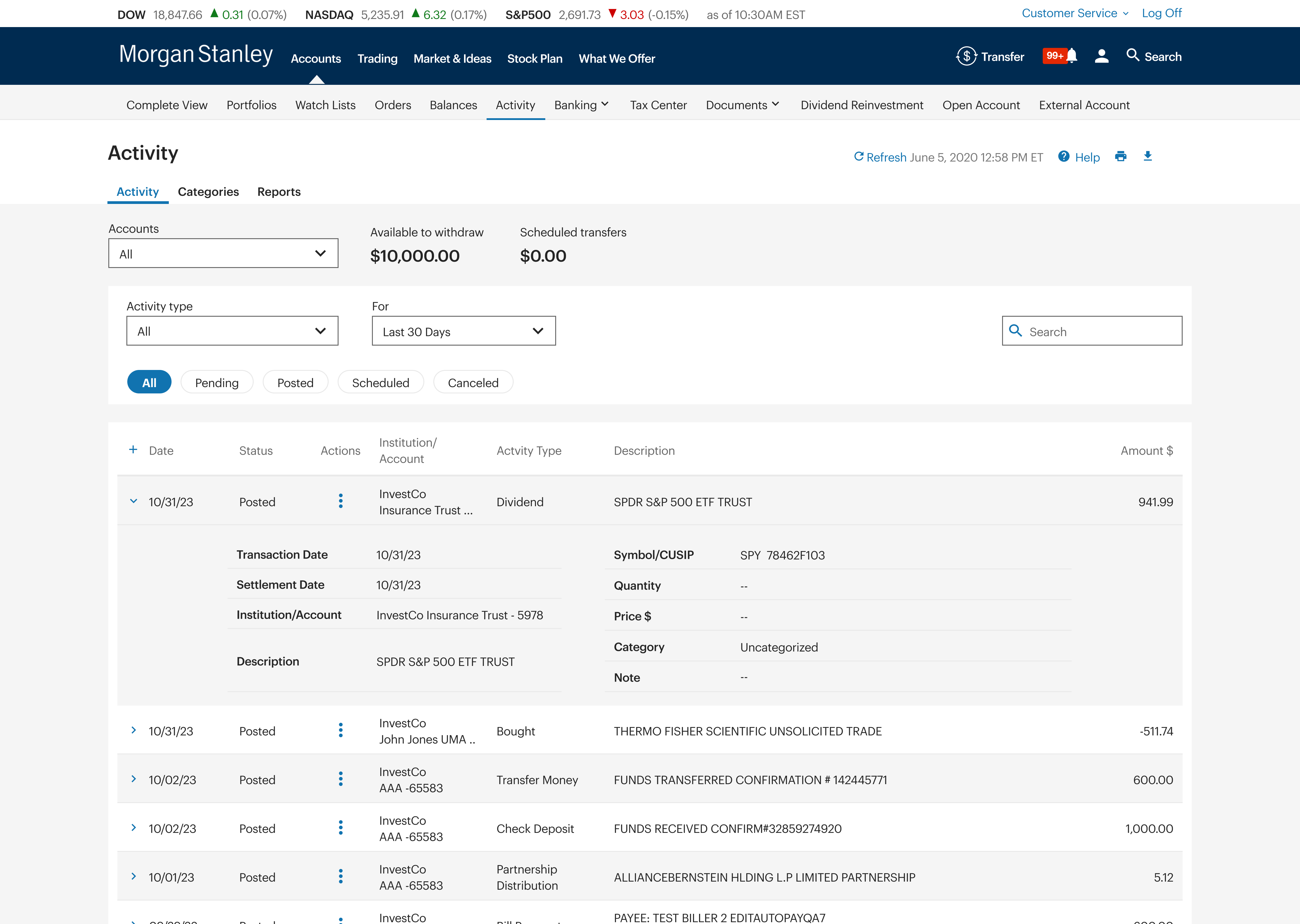
SARAH JOUNG

Morgan Stanley

Integrating two platforms into a singular unified, cohesive experience.

Overview

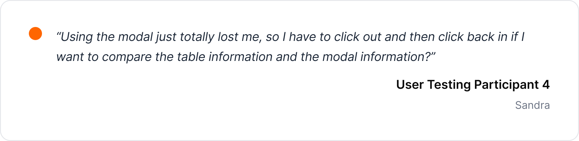
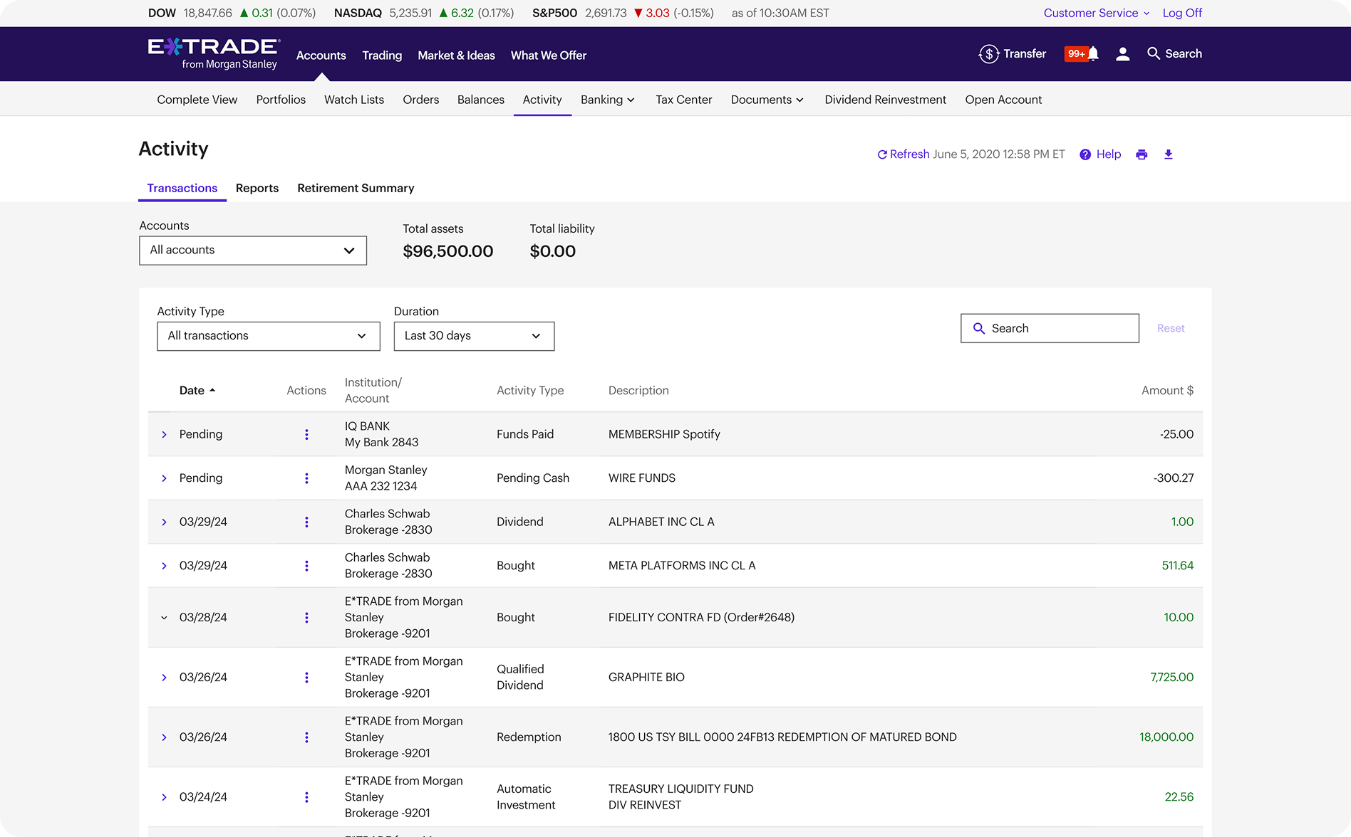
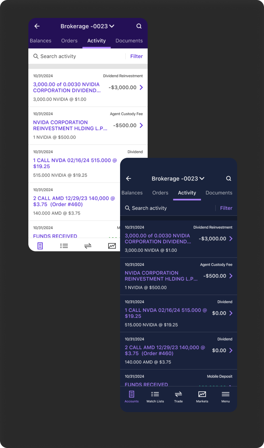
After Morgan Stanley acquired E*TRADE, I was the first designer to lead the unification of the two platforms, starting with the Activity page. By simplifying transaction data and aligning disparate design systems, I improved usability and supported a seamless transition for over 1 million users.

The Problem

When Morgan Stanley acquired E*TRADE, the Activity Page was chosen as the first unified client experience as its the most visited page.
Within it, the Activity Details component was a key pain point: transaction records were dense, inconsistent, and often difficult to scan.
Each platform had different structures and expectations, so clients risked feeling lost or frustrated if the redesign didn’t strike the right balance.

The Problem

Design the transaction details feature in the Activity page to be informative and easy to understand, because transaction data is often dense but needs to remain clear without losing context.

The Ask

Design the transaction details feature in the Activity page to be informative and easy to understand, because transaction data is often dense but needs to remain clear without losing context.

Aka. create a design that will be able to fit in a lot of data, but don’t make it look too crowded.

Discovery

Audit

Both platforms showed the same core transaction data, but differed in how much detail was visible by default and how secondary information was grouped and accessed.

  • Identified shared core fields (date, amount, symbol, type, status)
  • Flagged differences in inline context, grouping, and layout
  • Used these gaps to inform competitive analysis
ms img

Competitive Analysis

The dominant pattern across competitors was expanded, inline transaction details rather than modal-based views.

  • Reviewed transaction detail designs across 5 competitors
  • Identified expanded rows as the most common pattern
  • Related patterns to different user experience levels
  • Applied these insights to inform the unified design
Design Ideas

Vertical Design

What this is

A vertically stacked, in-row detail pattern used by Morgan Stanley and widely adopted across competitor platforms.

Why we tested it

To assess whether a market-standard pattern could support evolving analyst needs without sacrificing clarity or efficiency.

Design Ideas

Modal

What this is

A modal-based detail view designed for maximum space and flexibility as data and device needs evolve

Why we tested it

To see if a highly scalable pattern could future-proof the experience while still supporting core desktop workflows.

Design Ideas

Side x Side

What this is

A two-column, side-by-side layout that surfaces transaction details inline while minimizing vertical space, allowing multiple transactions to be expanded and compared at once.

Why we tested it

To see if a denser, side-by-side structure could support faster scanning and cross-transaction analysis.

User Testing

When testing three layout patterns, users strongly preferred designs that kept information visible and comparable within context.

  • Side-by-side supported left-to-right reading and comparison
  • Modals disrupted context and made comparison harder

25%

Preferred the Vertical Design

05%

Preferred the Modal Design

70%

Preferred the Side x Side Design

User Testing

Users find importance in quick skim as well as being able to compare transaction informations

Based on the usability testing, many expressed their need to compare between different transactions, so the modal option was not favored by many. While being able to compare, they also expressed their need to “skim quickly” so having the information side to side was “easier” than the vertical information.

Final Design

Side x Side

Based on user testing and stakeholder feedback, we selected the side-by-side layout and refined it to further optimize for density, clarity, and comparison.

  • Chosen based on strongest user preference (70%) and support for comparison workflows
  • Made row height dynamic to text length to minimize unused vertical space
  • Reduced and standardized column padding to increase information density without sacrificing readability
Impact

Early Signals

Before I rolled off the project, we released the design to a friends-and-family group and saw strong early indicators of improved usability and engagement.