The Problem
The Historical Value chart on E*TRADE was overly complex and hard to read. Instead of helping clients track performance and spot trends, the chart overwhelmed them with unnecessary details, making it difficult to make informed investment decisions.

The Solution:
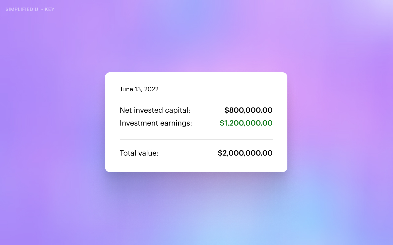
I redesigned the chart to be simple and focused. By cutting out noise and improving the hierarchy, the new design made it much easier for clients to quickly understand performance over time and make informed decisions.

Impact
After launch, page views on the Historical Value page jumped by 25%. Interestingly, the time spent on the page dropped by 5%, a signal that users were finding what they needed faster, without getting stuck trying to decode the chart. The redesign turned a confusing experience into a clear, actionable one.
