The Problem:
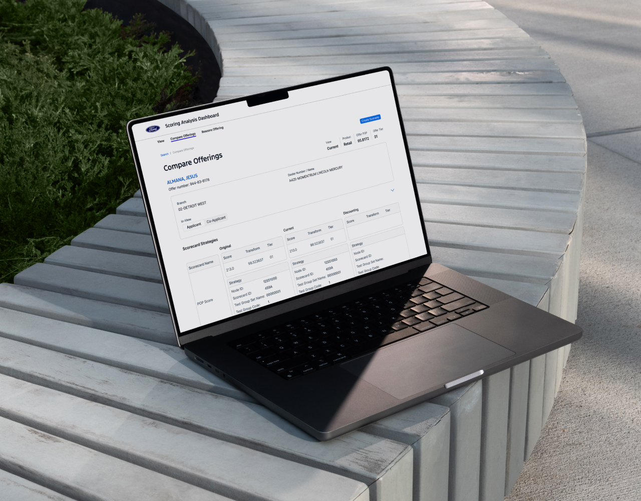
The Scoring Analysis dashboard was running on a legacy system that hadn’t been updated for decades. It consisted of outdated tables, poor hierarchy, and almost no flexibility. Risk teams struggled to quickly understand why an offering scored a certain way, making it slow to validate results or respond to requests from operations.

The Solution:
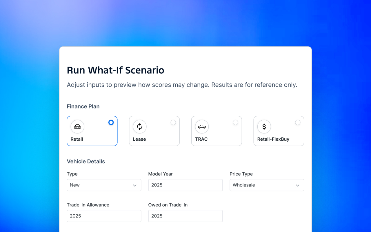
I redesigned the dashboard to make scoring variables and tier logic clear and usable. Alongside a streamlined layout and intuitive filtering, I introduced a new What-If Scenario tool that allows analysts to plug in changes and instantly see how scores and tiers would be affected.
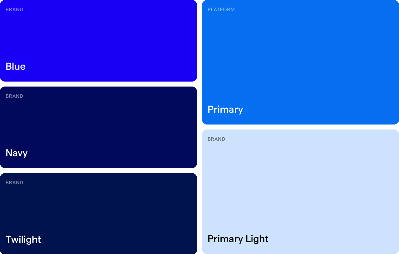
To support long-term scalability, I also built a lightweight design system and styling guidelines so developers and future designers could maintain consistency as the dashboard evolves.


Expected Impact:
The design is currently in development, with rollout expected in October. The intended impact is to reduce analysis time by 20% by making it easier for analysts to review POP and tier scores, validate why an offering scored the way it did, and respond more confidently to operations requests.
I’m tracking adoption, time-to-complete analysis, and frequency of What-If usage as key metrics to measure success once the dashboard goes live.
